A logo is an image that is supposed to be the representation of an organization. The logo’s job is to give off the same energy you would want people to receive when you describe the company or organization it represents. That being said, it is quite astonishing that there are actually people out there that are willing, and more importantly bold enough to, post a logo design job somewhere in the price range of $100. Some even are bold enough to disrespect the creative community even more by going as low as $50, some lower than that.

The designers that accept these quite disrespectful jobs can’t be fully faulted here, quite frankly they just don’t know any better. For the most part, the people taking these demeaning jobs are either young starving designers on their last dollar with no solid client in sight, a relative of the person posting who plays around in Adobe Photoshop Elements every now and then, or they were daring enough to take it into their own hands after getting no responses. This treatment of logo design is of course going to lead to the inevitable lower creative standards set for this creative practice. With a key creative field being demeaned every day, a client base for this field with an ‘ignorance is bliss’ mindset, and swarms of people claiming falsely to be designers, what is there for real professional creatives to do?
Well, taking a note from Hollywood, how about the celebration of just how awful these logos are? We spend so much time celebrating how good logos can be, and appreciating the expertise displayed in some, that we forget how wrong a logo can go in our bubble. That is why in this post you will see an array of awful and poorly designed logos.
*Disclaimer: Positions can easily be switched with the logos listed here. Once you start getting so bad, they kinda all can just be grouped.
Editor’s note: Razzie is “the foremost authority on all things that suck on the big screen.” source
30. Kraft Foods

Kraft Foods, its a carnival in your mouth.
29. NYC Taxi
New York City is considered a cultural hub of the world with an incomparable art and design community. This is really the logo they settled on for their taxi company?
28. Bing
Remember back in 2009 when almost every typography lover ripped this logo to shreds? Sometimes one has to wonder if Microsoft is just doing this on purpose.
27. A Style
Wow, the wonders of all the imagination that can go into the letter A’s letterform
26. Locum
Locum is a Swedish property management company.
25. Verizon
Here one may see a top telecommunications company. Another may see a big red V that looks out of place, and a text that is less than interesting. Your probably the latter.
24. NSW Government
Now this is definitely the logo of a governing body I can trust.
23. MSN
This is a good example of when redesigning a logo, taking things away can and will lead to bad results if done inappropriately.
22. Comprehensive Health Care

I do believe we just walked in on this home while it was undressing…. Shame on us…
21. London Olympics 2012

Its kinda hard not to see the little girl on her computer. Maybe she is designing a better logo.
20. PathMark

GREAT FOOD! GREAT VALUE! BAD LOGO!
19. Aldershot & Farnborough Twins & Triplets Club

Once again we have a child being placed in a position that just screams inappropriate.
18. Pepsi
You can never accuse Pepsi of giving falsely advertising to the public what the effects can be from drinking their soda.
17. Bureau of Health Promotions
I wonder exactly what type of health they are trying to promote here…
16. GAP 2010

Remember a little over a year ago when GAP changed its iconic logo, to, well, this and completely shocked the world? While also providing great logo design roast material for the designer community? This logo takes the classical flavor that is gap, and degrades it to that of some common store you see in the plaza of your local supermarket.
15. ENDRUN

Gotta give Paul Rand a designer’s pass on this one, I mean we all make mistakes. Legends may slip too.
14. American Pediatric Center
Well this position doesn’t seem compromising at all.
13. Office of Government Commerce

If the current global Occupy movement doesn’t illustrate how the people feel that government organizations could care less about its governed, then this logo sure takes care of that.
12. Dough Boys

With a logo like that, would you really want to get food from there???
11. Kudawara Pharmacy

Uhm..
10. Clinica Dental

That looks like a lot more going on than your regular cleaning if you ask me.
9. Hilton Worldwide
Alignment issues are one thing, but this level of bevel in a logo design is never acceptable.
8. The Detail Doctor
Based on the sketch of this car, seems like this doctor needs a better understanding of the word detail.
7. Portland Trail Blazers

So is this suppose to be a what a trail blazer looks like?
6. Mont-Sat

Um is that looking like a….. Yeah, that is exactly what it is.
5. KIDS EXCHANGE
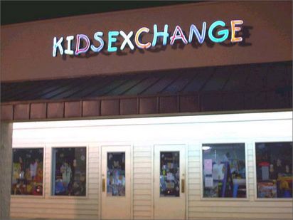
I didn’t know there are parents aletting their young children go through with this serious operation. What is the world coming to?
4. Catholic Church’s Archdiocesan Youth Commission

Now this isn’t alluding to anything about the stereotypes how the Catholic Church treats young children. I mean it even won a design award….
3. The Computer Doctors
I know one thing, I don’t want them anywhere near my computer.
2. Institute of Oriental Studies

Maybe from another angle, nope still looks like well….. what it looks like. Hope no young children are in the room.
1. The Cleveland Browns
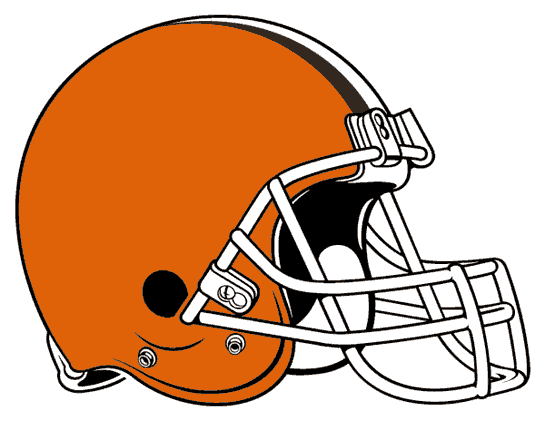
Is it me, or does it seem like this football team was just so lazy that they thought a football helmet would actually work? They could have just been cheap too.